DESIGN
Here are various designs I worked on using Adobe tools such as Adobe Photoshop, Adobe InDesign and Adobe Illustrator combing my photography skills with my record keeping.
BOOK COVER
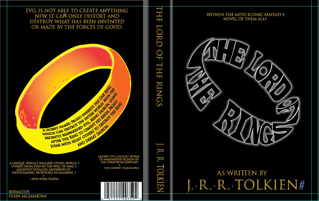
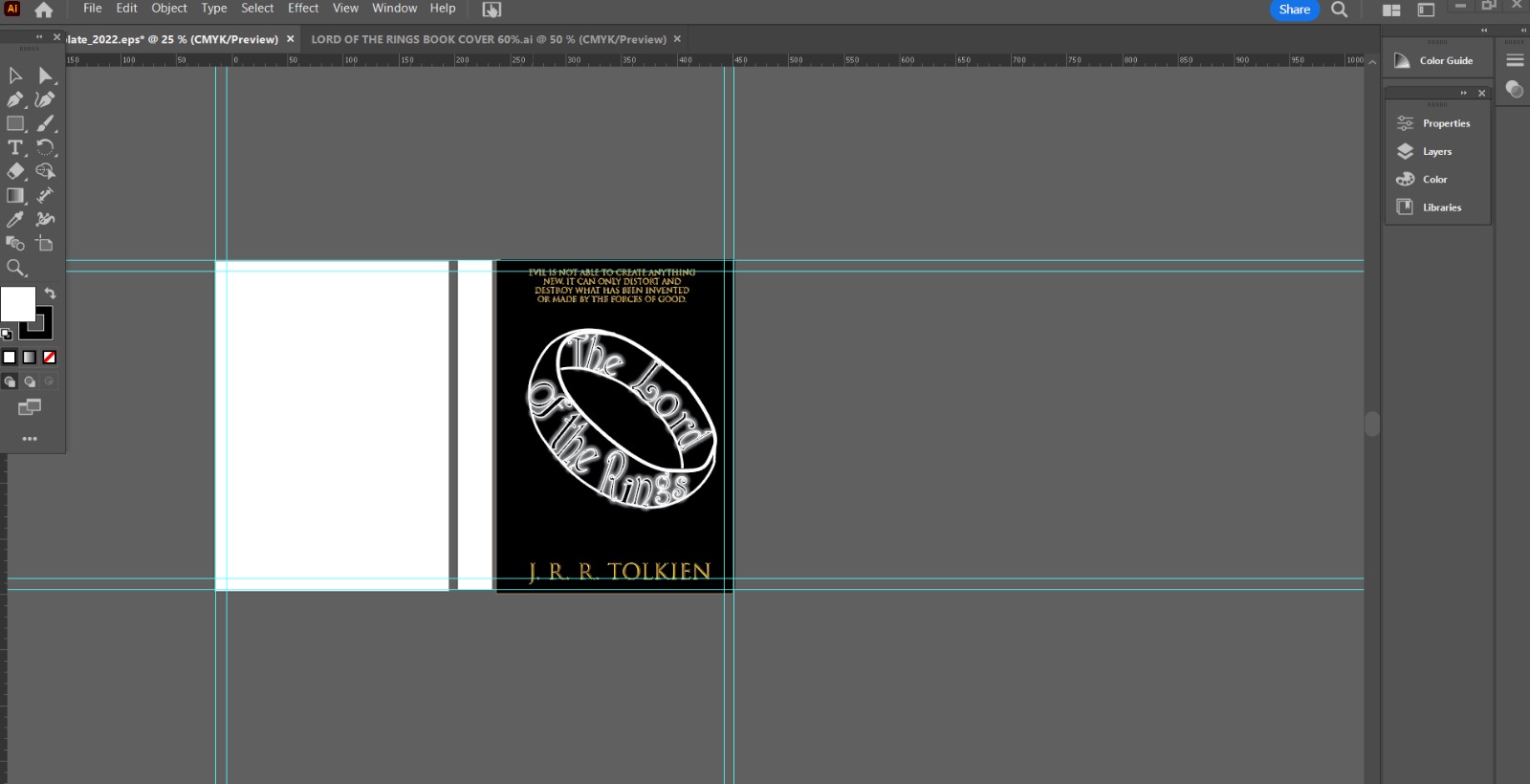
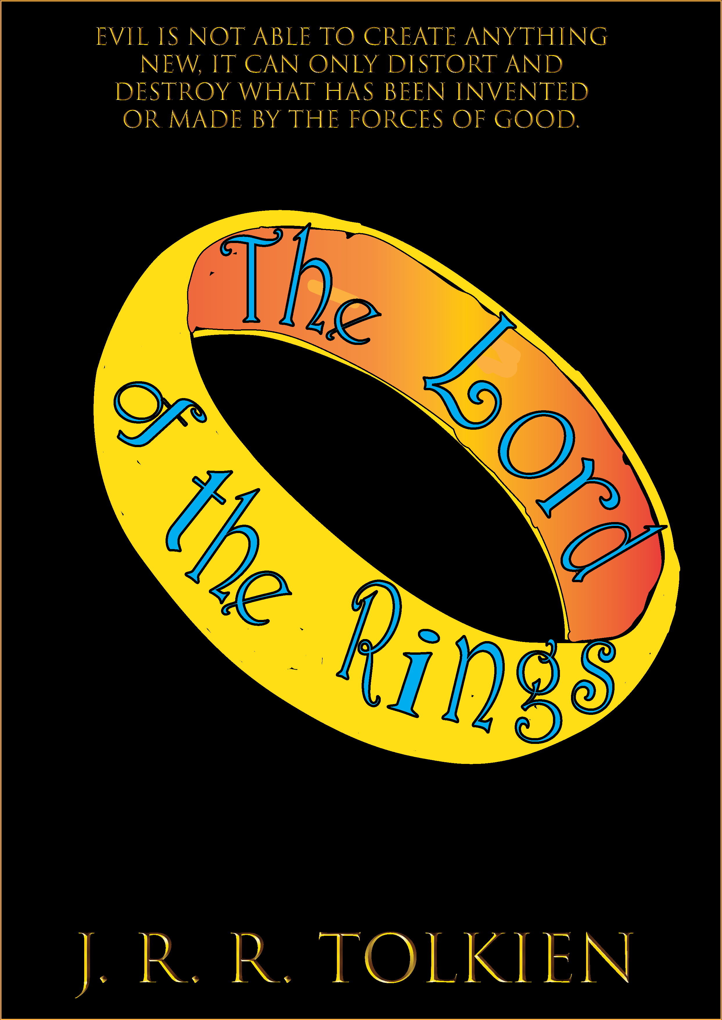
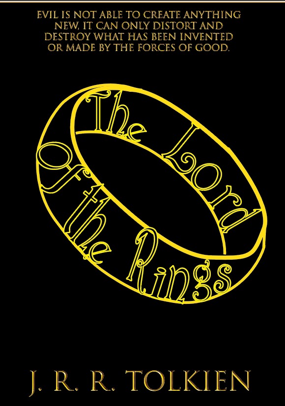
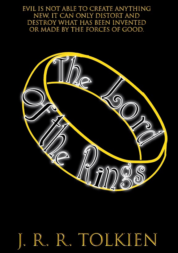
This was an assignment where we had to create a new cover for a classic novel, incorporating shape into the title. I choose Lord of the Rings, creating a ring shape from the title, as well as adding light to symbolize the power of the ring as well as the themes of darkness vs light. Various trials and errors on designing the cover.
MAGAZINE
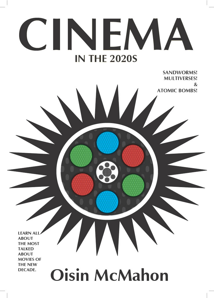
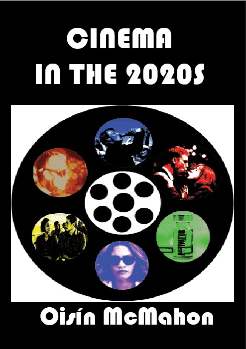
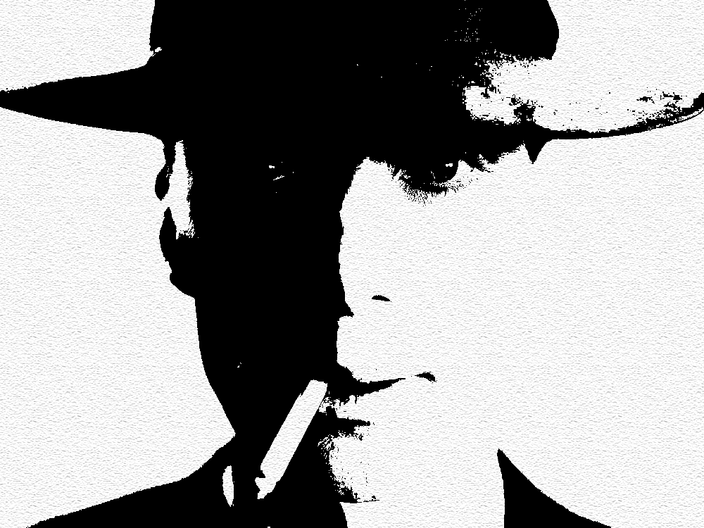
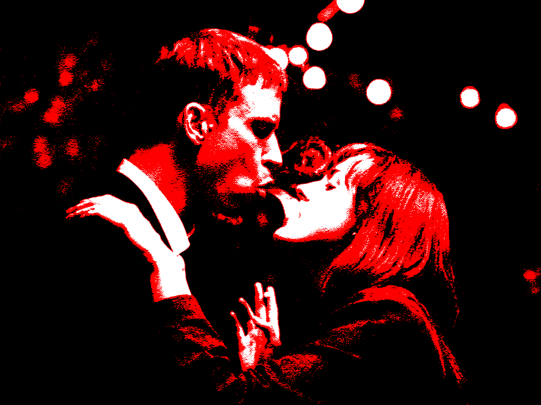
Magazine topic of our choosing which was meant to mimic the style of a particular artist. I had chosen a magazine based on movies released in the 2020s. I had aimed to make a movie magazine for beginners. Younger cinephiles who are just starting out. Like myself when I use to follow Empire Magazine and Total Film at ages 10 to 16.
Like myself when I use to follow Empire Magazine and Total Film at ages 10 to 16.
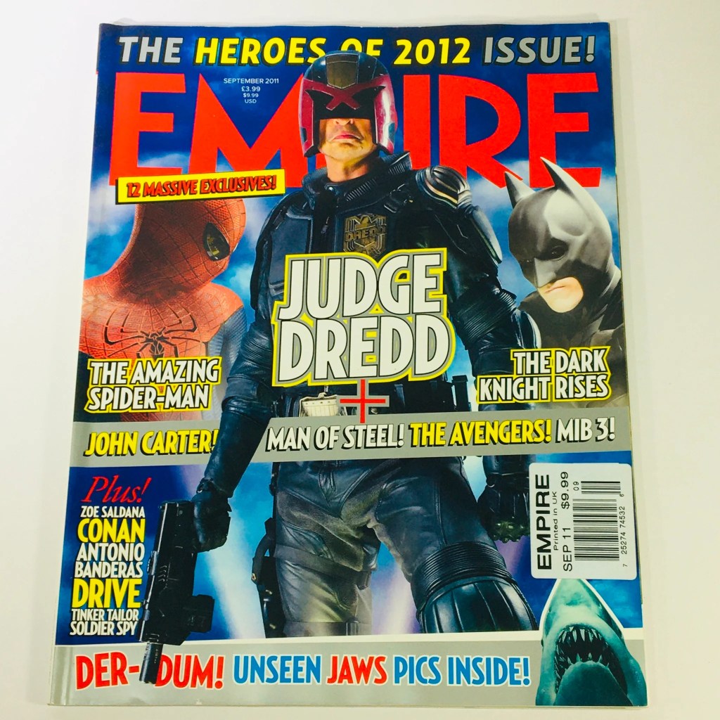

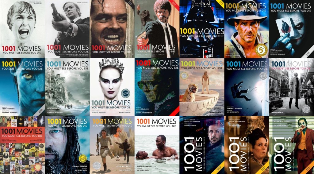
However instead of focusing on insider information or movie news, it would be more of a watchlist. A list of recommendations with some trivia sprinkled throughout. Similar to “1001 Movies To See Before You Die” but with a far less daunting title.
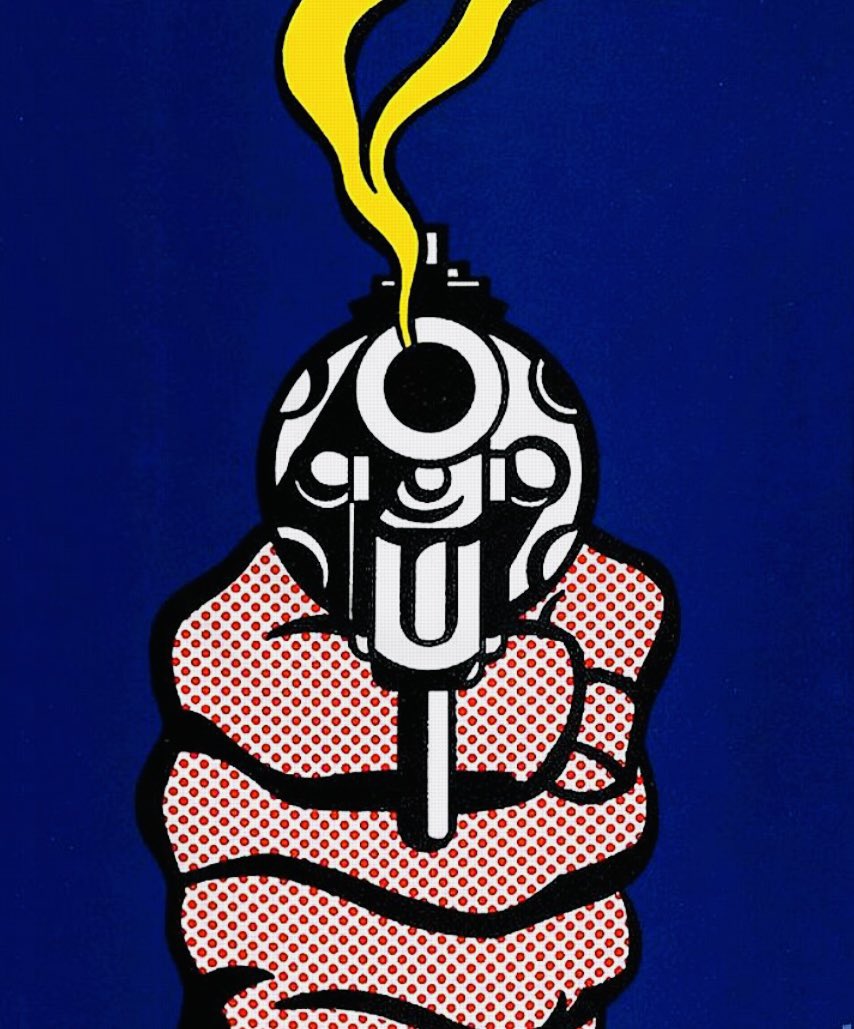
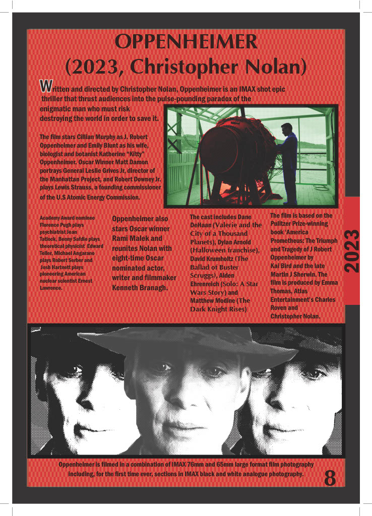
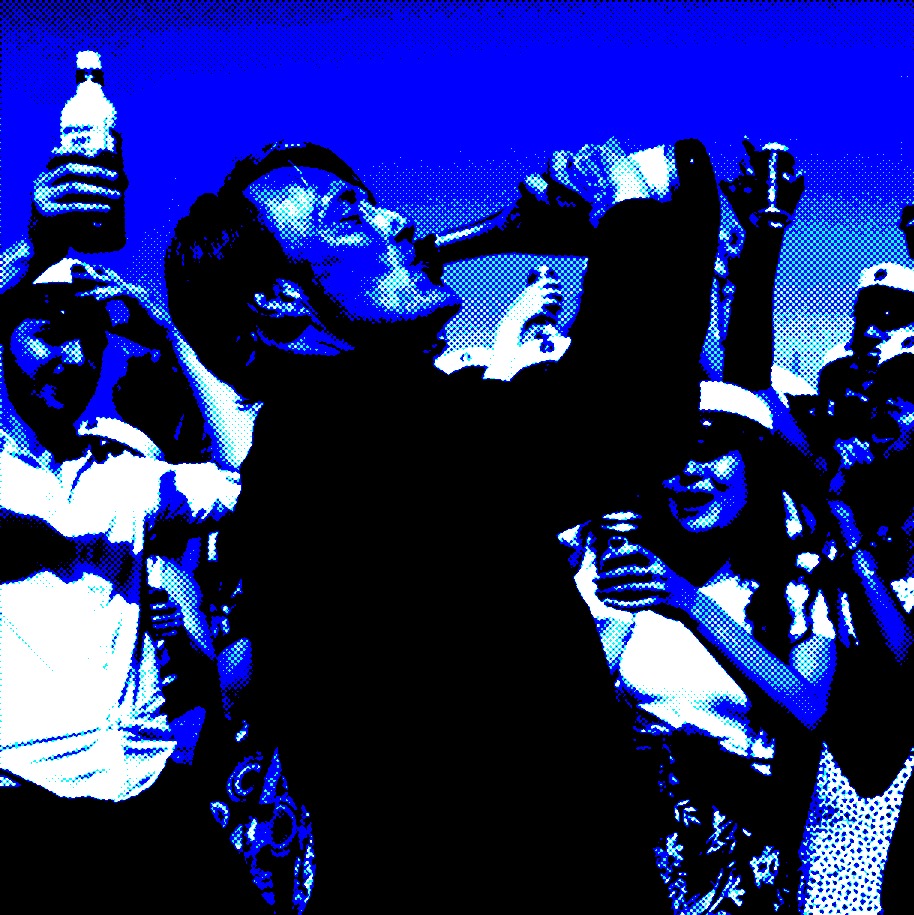
My magazine was meant to mimic the artwork of Roy Lichtenstein. This project took a serious “less is more” approach in terms of content and colour-scheme, which I have to thank Nicola Duffy for as that as it avoided the magazine being visual noise.

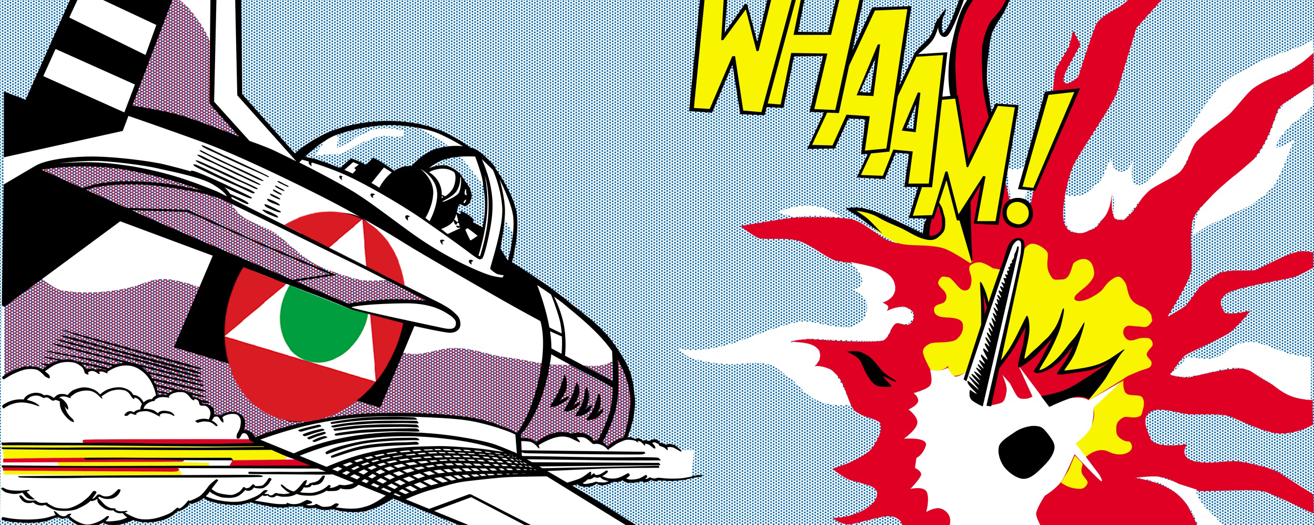
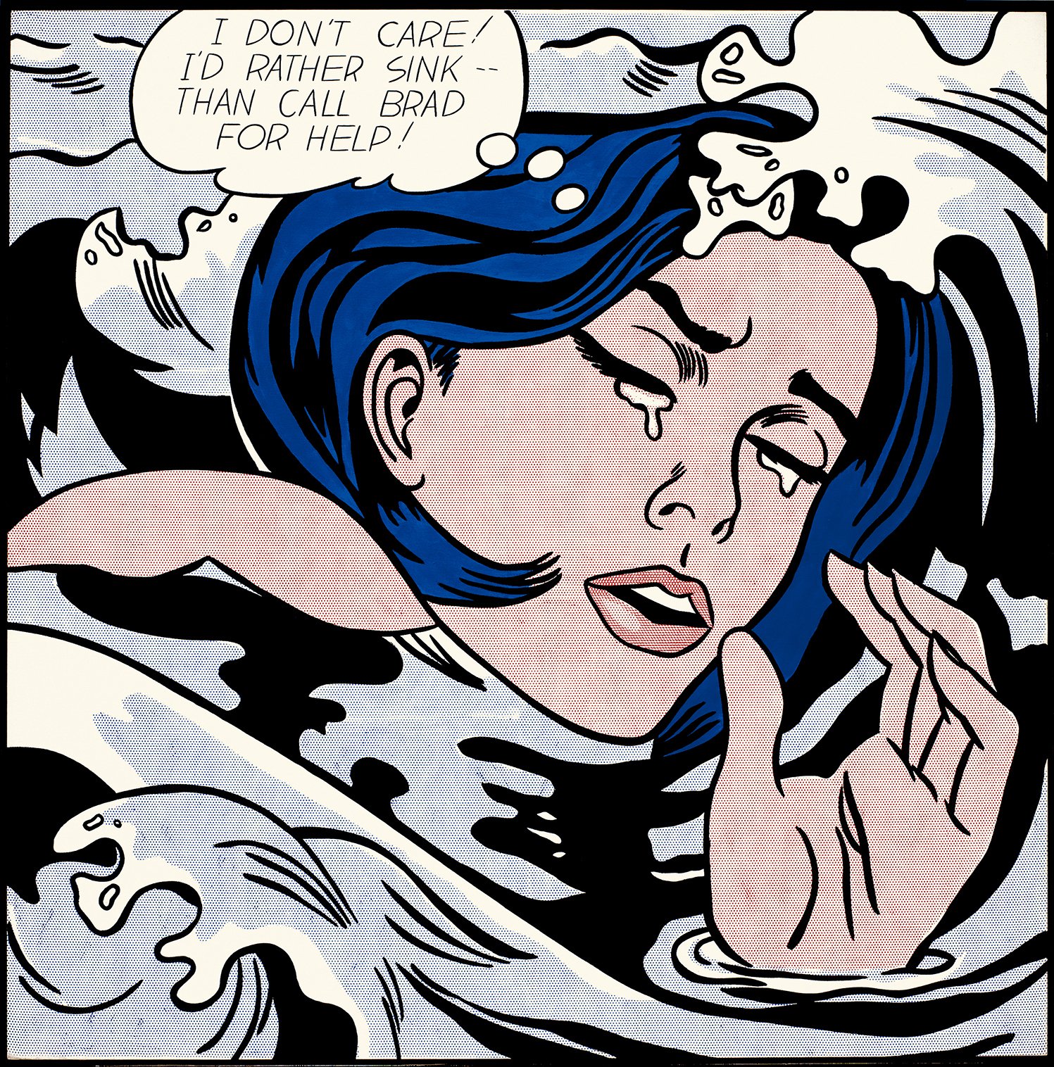
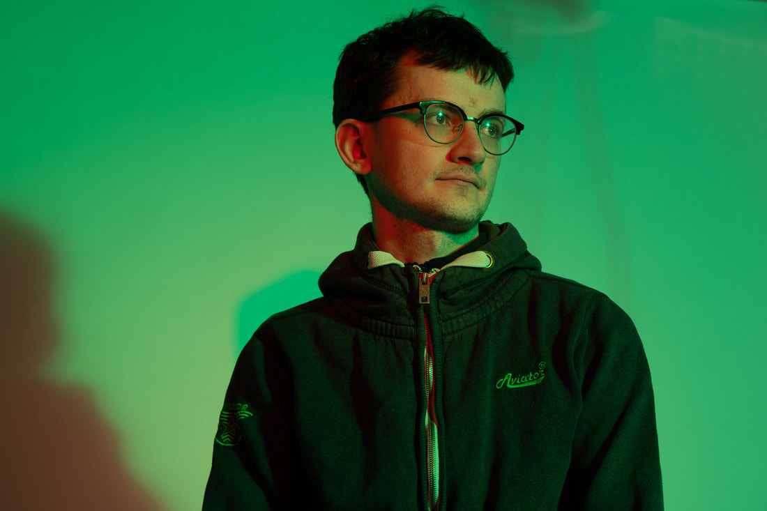
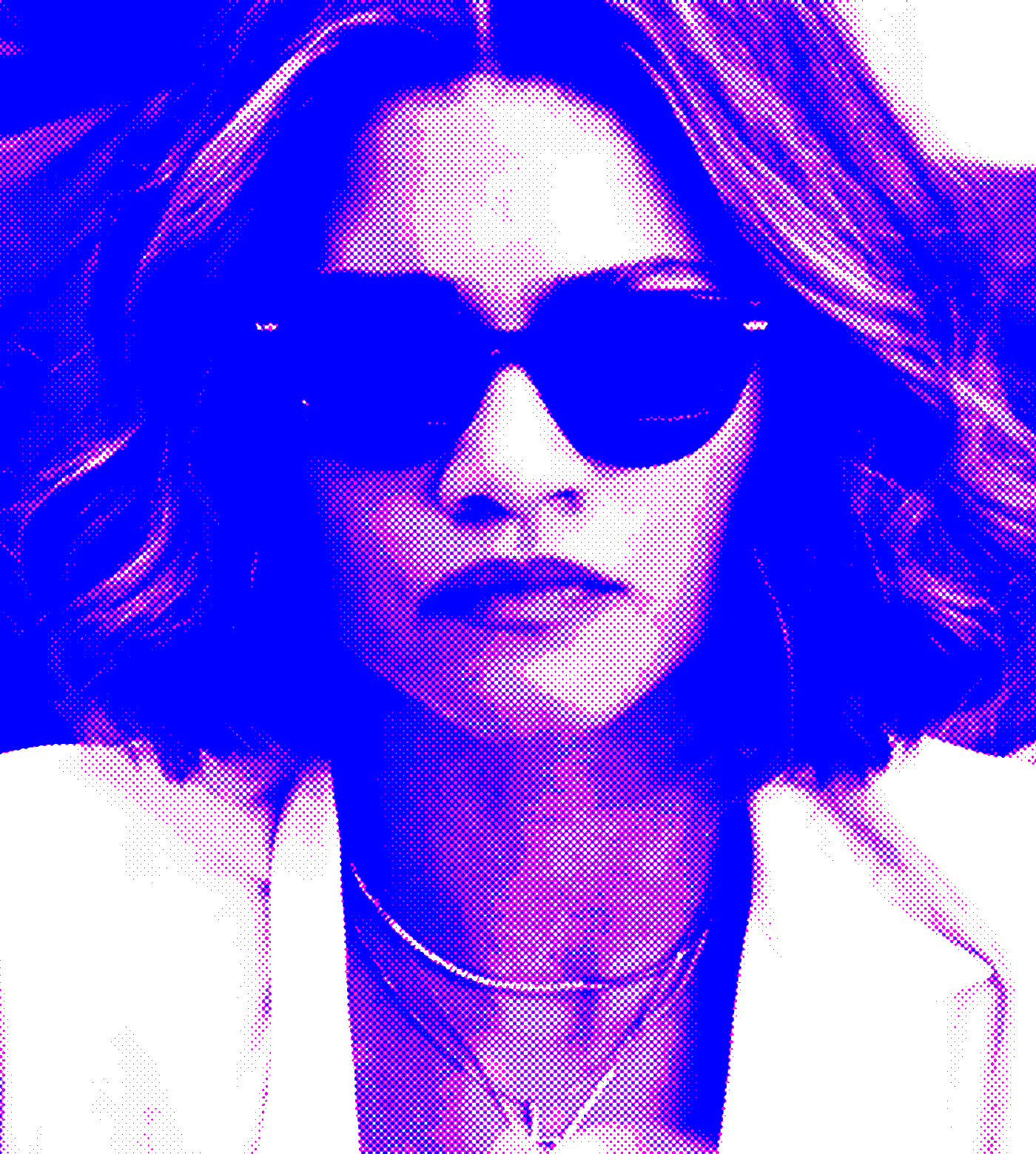
I had decided to get images from the movies and the people who created them and overlap the Lichtenstein style over them. I did a practice run with myself using an image provided by Auste Mockapetryte.
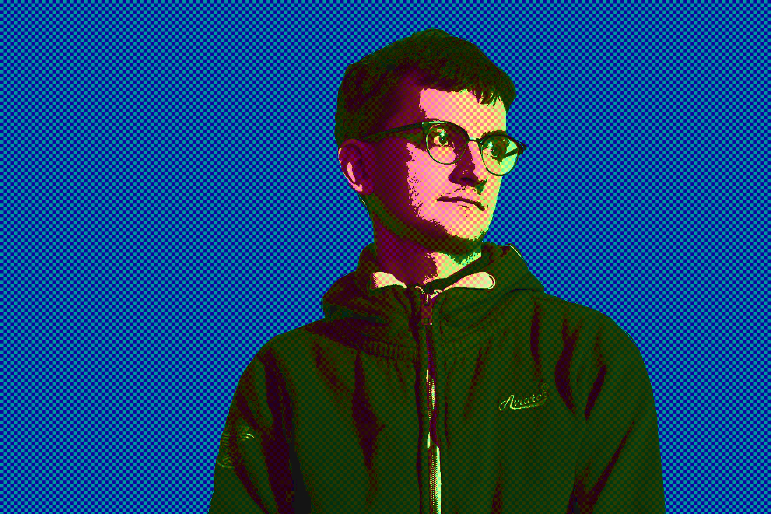
Then following from Nicola Duffy’s advice, I trimmed the colour palette down and began focusing on the three core colours of red-green-blue.
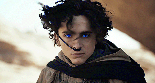
- Dune Part 1 used blue to the importance of blue to the story
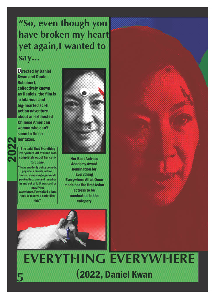
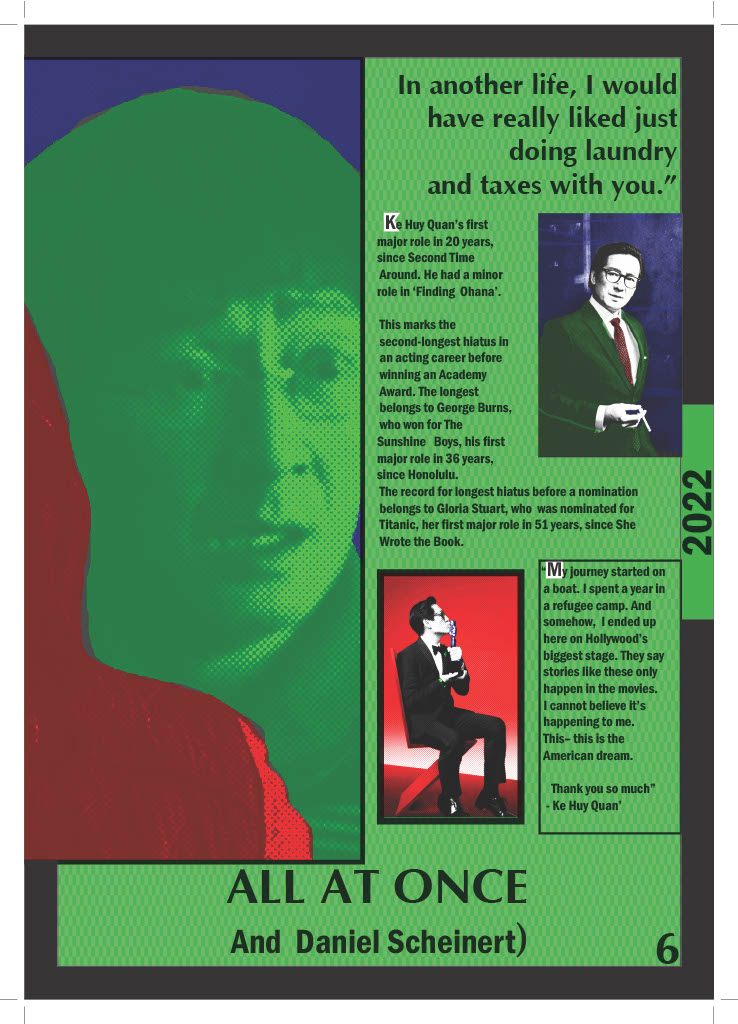
- Everything Everything All At Once used green for it’s most famous scene
- Oppenheimer used red due to the nature of the nuclear bomb
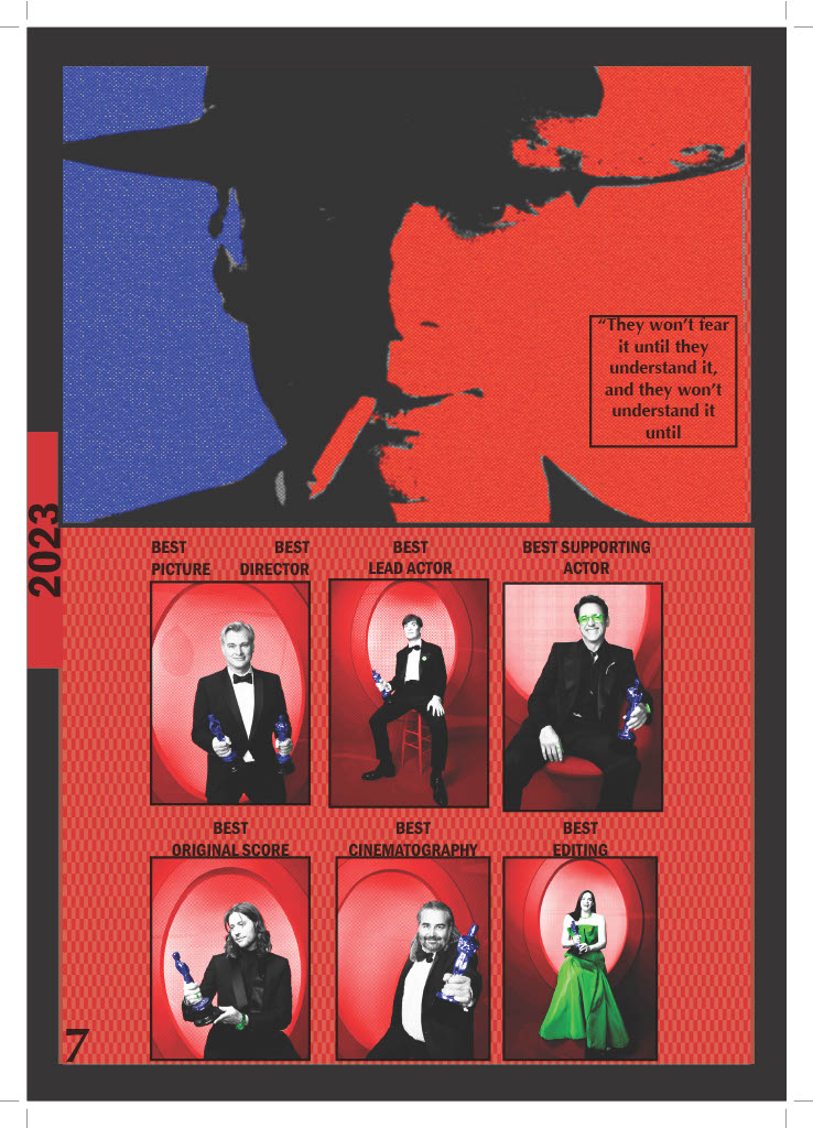
Side by Side comparisons:
Some early designs on the cover and the page layout.
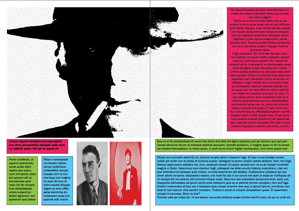
Now, I do feel like I could have improved on the art style. In hindsight, I perhaps could have used cyan/yellow/magenta to mimic the colours used for technicolour. Some actors do not have the fact for this style and their images had to be edited quite a few times in order to work. Trying to mimic a very particular style in photoshop did provide it’s challenges. But in my eyes there are diamonds in the rough and with lessons learned, I know that it can be improved upon next time. There are some pages that I was quite satisfied with.
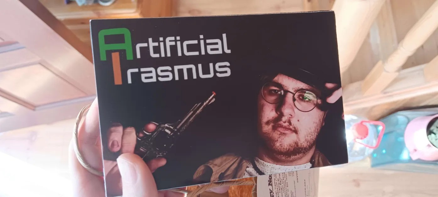
PROCESS BOOK
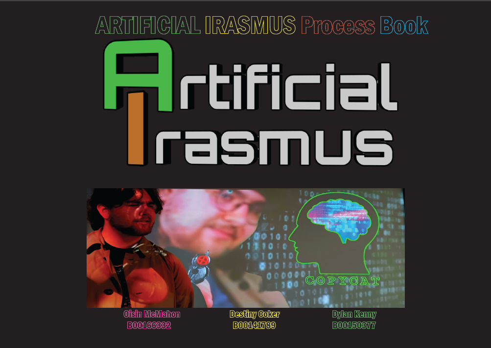
Process book for Artificial Irasmus, a short film about a dead actor being brought back from the dead with AI. I worked on this project with Destiny Coker and Dylan Kenny. There were some productions issues as the process book was not being worked on, so I had to take over this and redesign it all from scratch, however I ended up with sextuple the work done within a far shorter timeline with over 60 pages of content breaking down the story, costume design and character profiles.
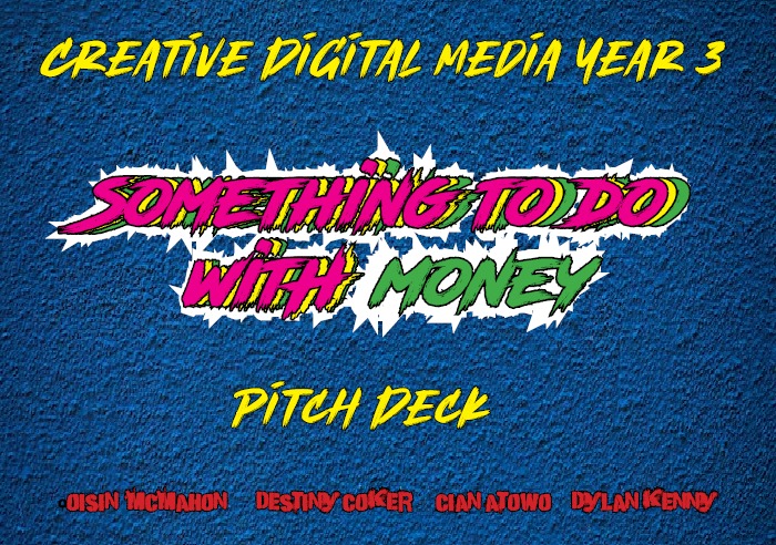
PITCH DECK
Pitch Deck for a short film by myself, Destiny Coker, Cian Atowo and Dylan Kenny called: “Something To Do With Money” . It’s a short film about a man who tries to swoon over a woman with a tale of how he got a bag of money, only for a friend to tell a different series of events. Meant to mimic the tone of ‘Uncut Gems’ with a visual style of Wong Kar-Wai’s movies.
POWERPOINT PITCH

Worked on a pitch for a magazine focused on rock’n’roll through the decades with Maksym “Max” Drozdovskyi and Artem Kiekshyn as we all designed the layout and template together. My part of the magazine pitched focused on Green Day, their album ‘American Idiot’ and their history as a band.
Full presentation can be seen below.
PROP MAKING
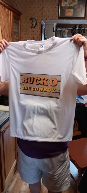
Props made for the short film ‘Artificial Irasmus‘, creating in-universe merchandise of the lead character Irasmus Kingston. Which you can see in full here.
This prop was made for ‘Just Another Part of Me’ as the object that sets the plot into motion. Which you can see here.
MARKETING CAMPAGIN
For theSmarter Travel Awards, we were asked for come up with effective promotional material that would encourage students to partake in more sustainable ways of transport. My solution was an app called ‘Phalanx’, a bus app that would let travellers know how many seats would be left on their upcoming bus and in turn would let the driver know how many travellers are about to get onto their bus. This poster can been submittedto the Smarter Travel Awards as a showcase.
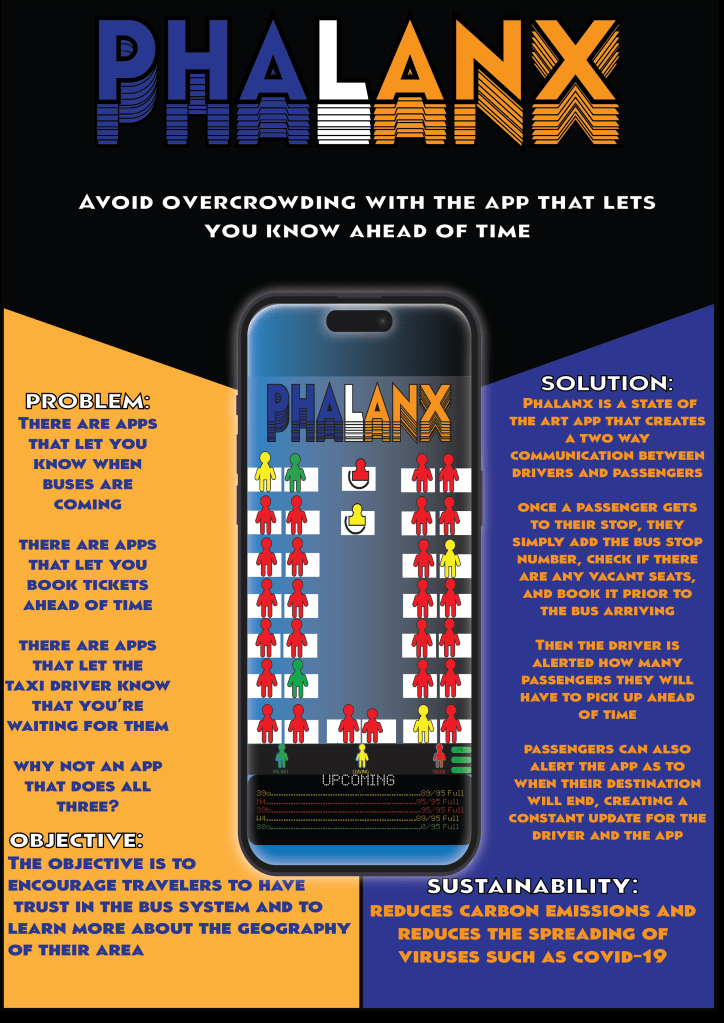
More information can be seen in the process book I designed and documented the entire thing myself but got feedback and support from fellow designer/photographer Roberta Kroteva.
There’s also a little video explaining the app to go along with it.
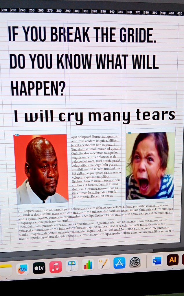
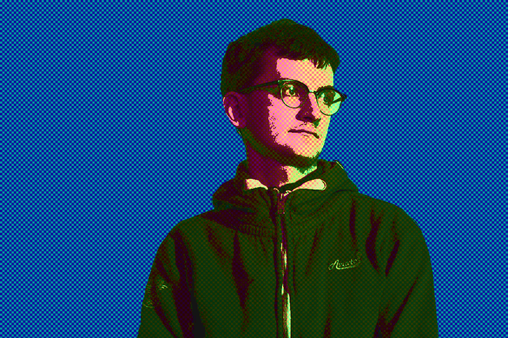
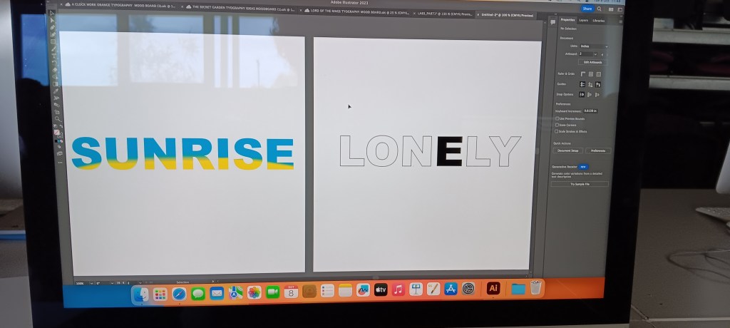
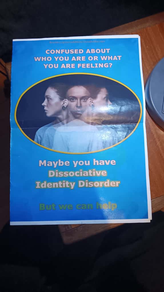
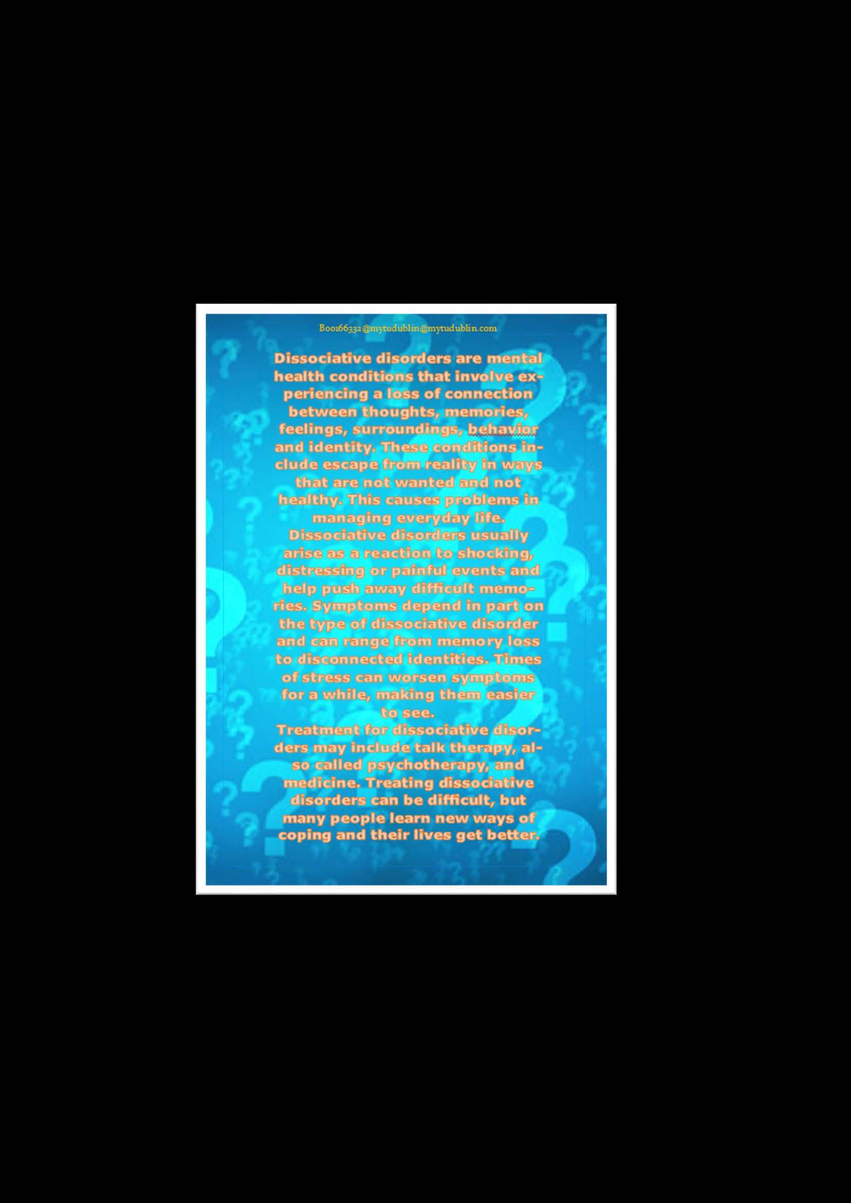
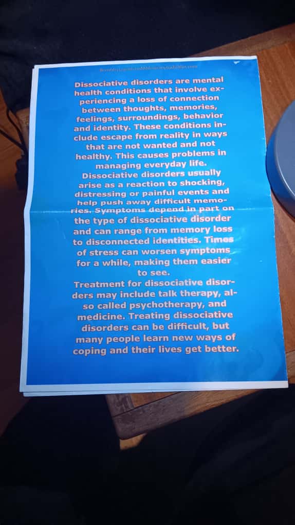
MISCELLANEOUS

These are images that I had worked on during various labs/assignments or as practice to get a better handle on the Adobe tools. Nevertheless, I’m very satisfied with how they turned out.